 NielsenNormanGroup User Experience 2004 – Trip Report
Amsterdam, Nov 1-3, 2004
NielsenNormanGroup User Experience 2004 – Trip ReportAmsterdam, Nov 1-3, 2004
|
||
AbstractTen years have passed since we ran our first Web usability studies in 1994. The Web is now 10,000 times bigger, technology has advanced, users have adapted, and designers know more about which designs actually work. What do these changes mean for Web usability guidelines? To find out, we conducted a major new series of user research projects that tested how people use individual websites and the Web as a whole, and which design mistakes cause the most problems in today's environment. Nielsen will review 34 of his early guidelines and tell you which ones still hold and which are ready for modification. He'll also reveal data showing the percentage of user failures caused by different categories of design mistakes. Finally, he'll report on five design strategies that proved particularly successful in supporting the way people use websites. In addition to illustrating his talk with many video clips showing user behavior from the Web 2004 project, Nielsen will answer the frequently asked questions: How many users scroll? How many users search? |
Some notes and highlights*** Guidelines that are still high-impact problems (after 10 years):
There are three reason why problems are less severe than they used to be 10 years ago.
1. Technology improvements** Guidelines that are medium severe due to technology improvements:
* Guidelines that are minor issues due to technology improvements:
2. Behavioral change in users; e.g. adaptions** Guidelines that are medium severe due to behavioral adaptions of the users:
* Guidelines that are minor issues due to behavioral adaptions of the users:
Guideline that is no longer a problem due to behavioral adaptions of the users:
3. Designers showing more restraint in use** Guidelines that are medium severe due to designers showing restraint:
* Guidelines that are minor issues due to designers showing restraint:
Guideline that is no longer a problem due to designers showing restraint:
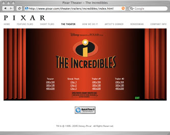
*** New GuidelineExample: Pixar’s The Incredibles
|
|