#17 Secrets of Chops, Vol.3
Part 1a) XXXVII, Section 4 paragraph 0.8
(you think I don't know this numbering stuff is goofy?)
Why?
Its quite simple: in the last chapter we had tons of textures flying around on the screen. Now you have one picture here and a background there and some logo in yet another image. How do you get them together, and cleanly...? This will talk about a whole bunch of ways to do it and include a lot of lesser known techniques to clean things up. This could prove to be extremely valuable in your set of tools.
(" He always says that. Everything he says is always really, really important. What an ego trip")
ooh , tough crowd.... :) Well, you be the judge.
What?
"Chops" are Channel Operations, those functions under the Image menu that you may have played around with before, more or less haphazardly. There really has not been very much information on this topic, other than self-referential descriptions a la "Multiply takes A and B and multiplies them..."
This is called "Volume 3" because KPT #1 and #2 were about some of the Chops commands, even though that did not include Compositing. I do recommend, even almost assume, that you read those files. There is a lot of basic information and tiny tips which I may not get to repeat here in detail. If you like this at all, please refer to them as well.
For download size reasons I also have to break this one into several chunks. While the overall topic is Compositing, I will meander through a variety of Channel operations first. The bulk of the Composite Command is in the second and third part of this document.
How?
Enough preambling ramblings, lets jump right in here.
I will create a logo with a texture inside and a textured background. In the process I will use a whole bunch of chops and explain as I go along.
1. Load the file KPT infinity plain.mask provided as part of this archive. It is a plain black Infiniy symbol, which you can also create in most fonts with the key combination option "5". (if you got this text in print form or not from America Online, you can of course do this with any black shape and at any size/resolution.) The provided file is 600x400
This is what you should have on-screen if you play along while you read this. (and as always the disclaimer: this is not meant for light reading. Its more like a blueprint for a house: work from it! Slap something together! Sell it to others for ridiculous profits! oops)
fig 1 a) 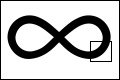 fig 1 b)
Plain black mask of the logo, here shown at 120x80 and a portion at actual size 600x400
2. The first Image > Calculation we'll use has been a staple item throughout the KPTs: Duplicate. We need more ingredients to create the elements in the logo. At first it is a simple black shape. Let's give it some depth and curvature. We need shading that follows the shape, but changes toward the edges. Easy as [[pi]] :
Image > Calculate > Duplicate, click ok. This creates a new window named "Untitled 2".
3. We need to create shading with this copy of the shape: Filter > Blur > Gaussian Blur...type in "9".
Note > the effect of the blur is size dependent. If you follow this algorithm with a file half the size or 4 times larger (and it is the real power of the technique that you can do that!) you may have to change settings like the blur to get equivalent results. Use "Levels..." to see the histogram and check whether the Gaussian Blur has created a nice even distribution without gaps.
fig 2) 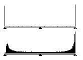
Levels... Histogram, top: before bottom: after Gaussian Blur
In fig 2 top you can see that there are minute amounts of 14 gray shades, plus lots of white and lots of black. These shades are inserted by the anti aliasing option in the text tool, in 4 bits grayscale.
fig 3) 
Gaussian Blur at "9"
4. This blurred shape will be used a little later, but we might also mess around with it in various ways. First we will employ it to create shadow and highlight, similar to the technique in KPT #1 and 2, but with a kick... We need two more copies for that: Image > Calculate > Duplicate , ok and again...
Note > No wonder I have a macro for this under the control-'d' key. Tip> Quickkeys lets you include the menu choice as well as the click on the OK button. You could also assign Shift Control D to another macro that does the Duplicate with the Invert option.
We now have three copies of the blurred shape. One will remain, aligned with the plain mask, one will be displaced to make a shadow and the third will be displaced in the opposite direction to create a highlight.
Tip >>> When you get into this on a more regular basis (and you will) there is an important method to improve the logistics of handling the ever increasing number of windows and files. This is especially true on smaller monitors. The masks and other temporary by products such as all the windows we have open so far need not be seen at full size. Simply press "command - " 3 times to reduce each window to a thumbnail sketch and then position them somewhere on the side. You can even overlap them nicely so that you see just a bit of the image and read the title bar. Its just a mnemonic reminder of what that window contains. Use the magnifier  tool and click three times inside a window if you need to see its content at actual resolution, yet still contained in the small window. Do try it..its very handy.
5. OK here we go: the shadow. Take one of the blurred versions and use Filter > Offset, set to 9, 9 ... This will move the image over to the right and down. You could also just drag a selection marquee around, of course, but the advantage of the offset filter is a) the precise and repeatable amount and b) it features repeat edges and even better, the wrap around option, although we're not using it just now.
6. Now to start Chop-ping... Image > Calculate > Blend... The pop-ups will show the currently active window title for your convenience. Click on one (doesn't matter which one, at least for Blend...) and select the original clean black shape there. Leave the destination as "New"
fig 4) 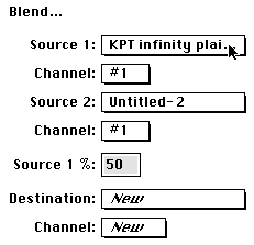
Blending the displaced blurred and the plain black mask...
fig 5) 
...yields a very nice curvature and slight cast shadow
The Blend function basics are explained at length in KPT #2.... It is actually related to the Add. command. Try Add with a scale of 2 to get the same results as Blend. With Add you get the extra option of an offset, which shifts all greyscale values up or down, although I prefer to do such processing with Levels... or Curves... The Blend percentage is a more immediate benefit.
7. Now lets do the inverse steps with the highlight. Pick one of the two remaining blurred windows and use the Offset filter on it. Simply add a negative sign to the numbers ("-9, -9") to displace it up and left. Then use Image > Invert .
fig 6) 
The blurred shape now offset and inverted....
8. Now lets blend that with fig 5) !
fig 7) 
The highlight and the shadow blended with the original shape
A very `depthy' logo shape with a glowing white highlight and a cast shadow on a medium gray background. And you can do it quite quickly once you know without hesitation what to do.
fig 8) 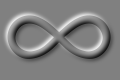
The result so far....
9. Now we have many options from this starting point. please keep this image around, we'll use it later in KPT #18 as well. With the ingredients so far we can achieve a bewildering array of results. Plain old experience will guide me, but the feedback loop is such that if you look at the results and think about what happened, it will make sense to you. It is only one more step or inductive reasoning to think of the desired effect first and back into the necessary technique, like little dominoes falling... For instance:
10. Lets say I wanted a darker flat shape, not as flat as the plain mask, but not tubular either. The Image > Calculate > Multiply command can add in the darkness of the original blurred image, (in the window Untitled-2, but that may vary depending what you did.... It's fig 3) above.)
fig 9) 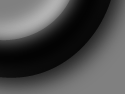
fig 3) multiplied into fig 8)
A nice flat black shape with just a small bevel highlight. If you like it, continue with a duplicate...
11. Consider this thought: figure 6) has a nice soft glow to it, but it sits on a plain black background. You can add all parts of fig 9) to that with the "Lighter" command.
Simply use Image > Calculate > Lighter and insert the appropriate window names (this is where it helps to see the thumbnail size windows behind the dialog...)
fig 10) 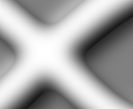
Image > Calculate > Lighter...9 & 6
This can really be quite a pleasing effect. Very `depthy' with slight roundness at the corners.
12. The concept behind "Lighter" is inanely obvious, pixel by pixel it compares two source images and picks the lighter one for the resulting destination image. The trick is to know what that does in real life and when to use it. You might even create a second channel, which is all black and merely concoct a slight specular highlight to add back into the original via Lighter.
Note > This is ultimately what I strived for myself and would encourage others as a goal: to be able to think of a final image in terms of many (dozens or hundreds) small elements and contributions and then have a way to create each one by itself and bring it all together. The single hardest part for a novice with this algorithmic painting technique is to come across in-between sketches and identify the one tiny little attribute that is worth keeping around (and then know how to extract and apply that). In the example just now, the statement "with slight roundness at the corners" would always raise a little flag with me and I'll file that away under " if I later want to, here is one with round corners I could steal..." I may even save it as "rounded corner mask"...(this is the reason to have optical or DAT storage where it is a non-issue to keep stuff around...)
Tip >>> Mono grayscale masks are saved smallest in gif, fastest in pict and surprisingly Jpeg High can end up with larger files than either gif or pict. (it is optimized for 24 bit). Jpeg medium I cannot recommend, as the `mosquito' artifacts around sharp edges are emphasized and in the context of mask use may propagate into final art. The effects can be akin to film grain...
Important Note >>> As mentioned earlier in the message folder: You need to realize that when you open a Jpeg file and resave it as Jpeg again, the compression artifacts will worsen through the multi pass treatment. (This is not a Jpeg specific point, it applies to ALL non-lossless compression techniques) Of course, merely viewing compressed images won't harm anything. But if you intend to make several passes of change, do save only the last version in a lossy compressed format!
"Lighter" is one of those things that did not even make it to the index of the manual, or is mentioned even once in the Official Handbook. The one line Adobe definition is on page 148 : "The Lighter command selects the lighter of the pixels". Well, I guess that's why I am writing this in the first place.
Often times the related version "Screen" is more predictable, I'll use that one later as well.
For now, lets forge on with the logoids...
13. Lets say we are after a more metallic look. This is not the document to focus on that, but let me mention that there are ways to make very realistic Gold, Chrome, Copper, Titanium and more purely within Photoshop. I will go through one of these here now, but you might want to stick with it and try to develop the others as well. I'll point to the various off ramps as we pass by them.
The essential technique for metallics involves reflections and highlights suggesting the environment being mirrored in the glossy finish. (Rust and patina fall into other categories...)
The key to it all is to understand that there is really no such thing as a "Gold" color. Where in the rainbow would you place it? Worse yet, where would you put Silver and Chrome? All of these are actually collective terms for the range of shading that reflections will produce. The physics involved can be quite daunting, but that need not concern us.
Gold would be characterized by a yellow/orange/greenish tone that can tend toward white in specular highlights and toward darker browns in shady areas. When I first puzzled over what makes gold gold the single most educational process was to scan in photographs of golden objects, such as the King Tut mask (thanks, Steve M.) and study what happens.
One can use either the Arbitrary Map or the Curves dialog to create special highlit regions. I recommend that you do not simply take the last version just because you think its closest to a finished piece and then run Curves on that. The process may include artifacts such as aliased `raspy' edges...
Note > it is important not to dismiss intermediate images because of staircase edges, or other problems. You can extract just the good stuff. "Composite" will do exactly that! Read on...
The perfect starting point is the gaussian blurred original, as in fig 3). It has all shades of gray available on a neutral background. If we didn't have it already I would have made one just like it now. Since it may come in handy for other effects later, lets do this on another copy (Duplicate....)
14. First a quick treatment that can add surface bumps to get the hammered copper look. With the simple blurred image (fig 3) run Filter > Find Edges once, then Sharpen More twice.
fig 11) 
Edges, Sharpen gets neat bumps
The Electric Aura KPT file explained a bit more theory behind Find Edges and why it does what it does. To be able to predict better what happens you might want to read that.
Now two more quick steps to tune this: Invert to make the center a highlight and Levels...click on the Auto contrast button or drag the black triangle to the right. Also, move the bottom white Triangle to the left "222". This will make sure that the center white highlight is not true white (some color work will not affect solid white or black)
fig 12 a) 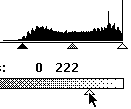 fig 12 b)
Levels adjustment will create higher contrast
15. Now lets colorize it: First change from Mode > Grayscale to Mode > RGB
For more basics and theory on Colorization, read #12 and #13...on Colonization read the Columbus log book. Actually, gotta give the guy kudos for one reported episode: the one where he asked "How do you balance an egg on its side?" Nobody could do it. Then he simply smacked it on the table and it stood on the flat dented bottom. He said: "Anything seems easy after you are shown how to do it" My words, exactly. But I digress.
OK, In RGB mode go to Image > Adjust > Hue/Saturation. Click the Colorize button and set the sliders to get copper or gold, somewhere in the Hue +25-50 range, Saturation 50-100 and Lightness -25 to -50, as shown here. Season to taste. Final adjustments later...
fig 13) 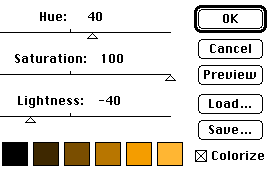
fig 14) 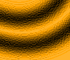
The inner portion of the image is taking on a hammered metal feel
16 . So now we are looking at the quintessential Compositing task: steal the center portion of this metallic image and add it into one of the other backgrounds.
The Image > Calculate > Composite dialog can do this very easily, but I am afraid you will have to download and read part two to find out. Wasn't meant to be a cliff hanger, but I guess it turned out to be one.
Merry greetings Kai
Tell Compuserve and Adobe if you find these tips cruel and unusual.
By Matthias Müller-Prove. Modified:
5/1/20
