2 The Software
mprove: 10k hits today. I appreciate your interest in the history of our digital design field!
2.1 Maximize the Interface
2.1.1 Full Screen Mode
Kai describes how it came to the large dialogs in KPT3:
»I would love to interact with the image in the way that Levels or Curves does, but the plug-in interface as of today simply will not allow it. What that leads to is simply that the plug-in gets a rectangle and is supposed to do something with the pixels in some other room and then give them back.« [Kai95]
Many of the filters in KPT3 like KPT Texture Explorer, KPT Spheroid Designer and KPT Convolver use a rectangular area that fits on a 14" monitor. All other elements get blacked out – no menu bar, no Photoshop image window and no desktop. The user experience is really like coming into a room with a special suited environment for one specific task.
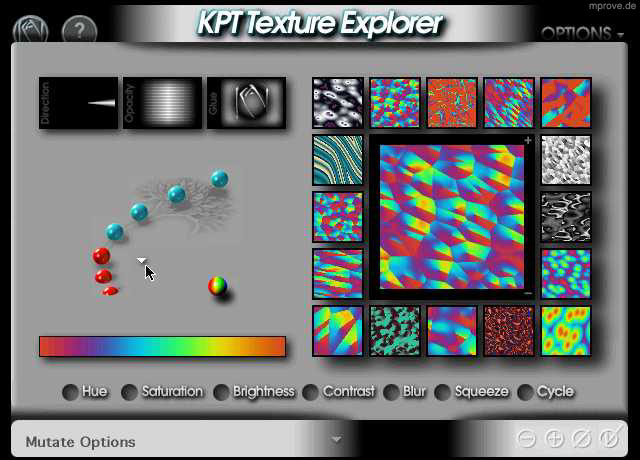
Fig. 2 KPT Texture Explorer 3.0
KPT Texture Explorer is a modal dialog, that is especially prepared to create textures and nothing else.
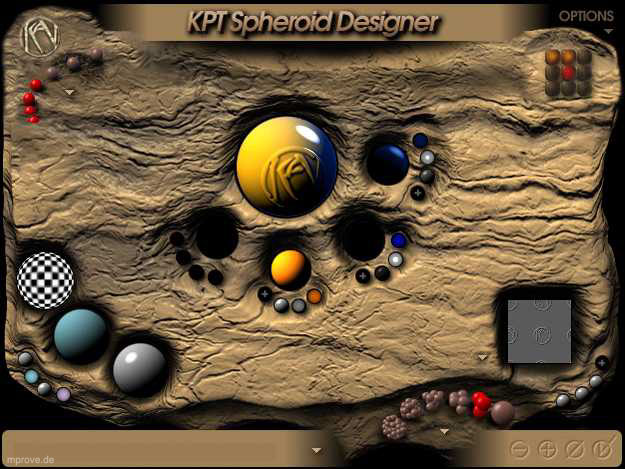
Fig. 3 KPT Spheroid Designer 3.0
KPT Spheroid Designer is meant to create collections of special looking orbs. Different controls allow the definition of light or to select a special surface structure for the orbs. The KPT users manual notes that Spheroid Designer may seem to resemble glass balls dropped into mud, but actually it’s meant to be glass balls embedded in an “old stale brownie”. [Lombreglia97]
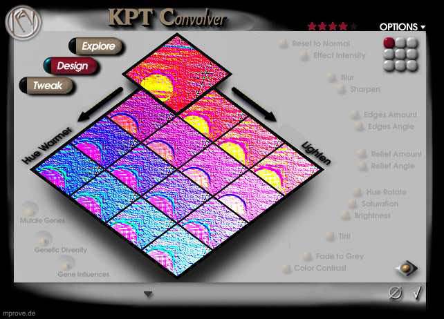
Fig. 4 KPT Convolver
Bruce “Tog” Tognazzini writes about “Kansei Engineering”:
»Since the year A.D. 618 the Japanese have been creating beautiful Zen gardens, environments of harmony designed to instill in their users a sense of serenity and peace. (…) Every rock and tree is thoughtfully placed in patterns that are at once random and yet teeming with order. Rocks are not just strewn about; they are carefully arranged in odd-numbered groupings and sunk into the ground to give the illusion of age and stability. Waterfalls are not simply lined with interesting rocks; they are tuned to create just the right burble and plop. (…)
Kansei speakes to a totality of experience: colors, sounds, shapes, tactile sensations, and kinesthesia, as well as the personality and consistency of interactions.« [Tog96, pp. 171]
Then Tog comes to software design:
»Where does kansei start? Not with the hardware. Not with the software either. Kansei starts with attitude, as does quality. The original Xerox Star team had it. So did the Lisa team, and the Mac team after. All were dedicated to building a single, tightly integrated environment – a totality of experience. (…)
KPT Convolver (…) is a marvelous example of kansei design. It replaces the extensive lineup of filters that graphic designers traditionally grapple with when using such tools as Photoshop with a simple, integrated, harmonious environment.
In the past, designers have followed a process of picturing their desired end result in their mind, then applying a series of filters sequentially, without benefit of undo beyond the last-applied filter. Convolver lets users play, trying any combination of filters at will, either on their own or with the computer’s aid and advice. (…) Both time and space lie at the user’s complete control.« [Tog96, pp. 174]
Many of the interface ideas evolved from KPT into Bryce. It is a whole environment that covers the complete screen. It overcomes the limitation of a fixed 14" rectangle, because the interface scales itself to the according screen dimensions. The same holds for Poser3 and KPT5 as they were shipped late in 1998.
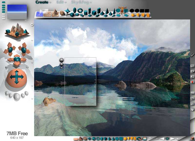
Fig. 5 Bryce 2
2.1.2 Rooms
»The writer John Updike is said to have several different writing rooms in his home, each used for a different kind of work -- a fiction room, a poetry room, a room for writing essays and book reviews. All writers want a special room for working (with door, without telephone), but why would any writer -- even such a deservedly successful and prosperous one as John Updike -- need entirely different rooms for different kinds of writing?
Actually, I know exactly why. Mr. Updike’s arrangement sounded great to me the first time I heard about it. I’m sure working in those rooms is his way of staying inspired, fighting boredom and distraction, getting creative work done by being in a space that’s not only set aside for work but that also somehow provokes that work, probably in quite subtle ways.« [Lombreglia97]

Fig. 6 Kai’s Power GOO
The GOO room is a specialized environment for shifting pixels around. But because Kai’s Power GOO is one of the first stand-alone applications from MetaTools some operating systems tasks like opening and closing images need to be accessible within the application. In order not to clutter the room that is special suited to edit the image other rooms become part of the application. E.g. Kai’s Photo Soap (Fig. 7) initially presents you with a series of seven “rooms” – In, Prep, Tone, Color, Detail, Finishing and Out – which one can enter to perform particular tasks.

Fig. 7 Plan-Room in Kai’s Photo Soap
2.2 Minimize the Interface
The concept of Magic Lenses was introduced by [Bier et al. 93]. Two years later Kai designed a tool for KPT3 that can be dragged on top of an image. A circled look- through area shows a preview of the selected filter attributes.

Fig. 8 KPT Lens f/x 3.0 on top of a Photoshop image window
Kai himself describes the design concept that lead to the lens tool in KPT3:
»What is called the “lenses” was in alpha known as the Dragon, as in “drag-on-the-image” and its design concept was so simple: make a precision instrument, like a little Swiss Army knife or a watch or microscope (it was also known as the fx Scope…) which has just a few very tiny controls around a center window. In this window a number of effects could be shown exactly as they would appear, over the real image, and updated in realtime.
It’s a lovely idea to keep all kinds of options hidden inside little wheels and dials that pop out to set and hide themselves during use… I think we have barely begun to use all the possibilities of that. And the actual interaction with the screen image is still a little clunky, hampered by the very illegality of bypassing the plug-in interface altogether.« [Kai95]
Soap is the consequent next step into this direction. The tools no longer need to be modal like the KPT lens; they can be used in a very natural modeless manner. Pens, brushes and erasers are distributed all over the workspace. They are large, they drop real shadows, and the tips of the tools get pressed down while they are in use.
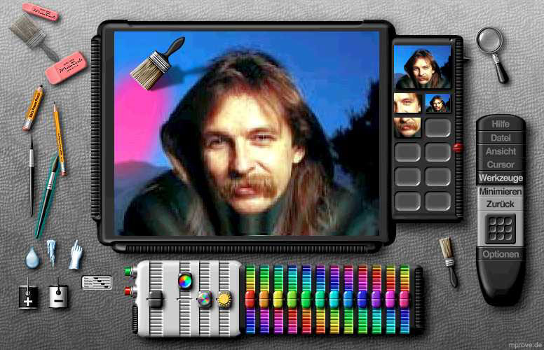
Fig. 9 Kai’s Photo Soap, the Color Room
2.3 The Desktop
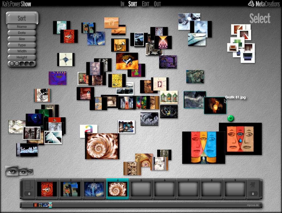
The In rooms from Soap and Show are an attempt to deal with a large amount of imagefiles. Large previews – compared to normal icons in Finder – can be distributed on a desktop area. They can be scaled and they can overlap each other. Selections of them can be stored into scrapbooks (Soap) or treated as pile objects (Show). The latter is a proposal to avoid the classical “file in folder in folder in folder” method. The stack of white images to the upper right in Fig. 10 is an example for a pile.
Update 2015
In retrospect many of Kai's user interface designs make perfect sense as iPad apps. Just imagine KPT Spheroid Designer or Kai’s Power Goo as an app!
Ben Weiss, Kai Krause, together with Tom Beddard have created frax HD that was launched in October 2013.
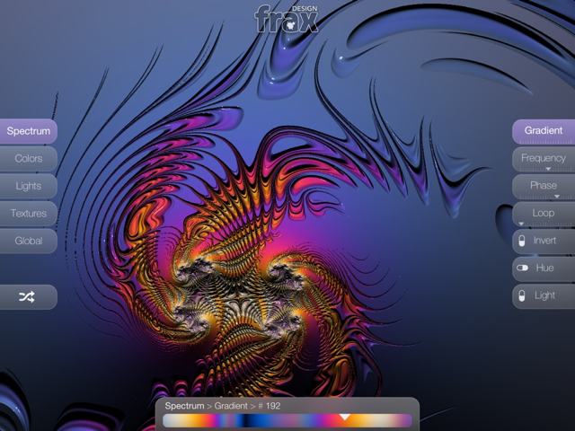
Fig. 11: frax HD
Feedback – please leave a message
 hci.social/@mprove or norden.social/@chronohh
 mprove@acm.org
- More channels
>> backlinks
