3.3 Windows, Icons, Menus, and Pointing Device
in Vision and Reality of Hypertext and Graphical User Interfaces
These are the main components of typical graphical user interfaces like Apple Macintosh and Microsoft Windows. WIMP**'Windows, Icons, Menus, and Pointing Device’ is abbreviated as WIMP. Opposed to that, Ben Shneiderman defines WIMP as ‘Windows, Icons, Mouse, and Pull-Down Menus’ [Shneiderman 98, p. 207]. But this is not as general as the definition used here. interfaces often come along with the desktop metaphor. This section takes a closer look at the pieces one by one.
3.3.1 Windows
Windows have a natural affinity to paper. They are rectangular framed areas on screen that can be moved around like their physical counterparts. Windows do overlap like real paper does – nearly everywhere in current graphical user interfaces.
In contrast to paper, computer windows can be resized, and the content area can be much larger than the actual window frame is. Horizontal and vertical scrollbars are deployed to move the content into the visible portion of the window. The metaphorical relation between windows and paper becomes weak with respect to the content displayed. A relation between window and document is more appropriate.
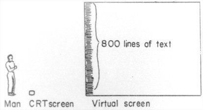
Fig. 3.14 Relationship between Window and Document. (a) Illustration by Alan Kay, 1969
Fig. 3.14 (b) by Apple 1995
Especially if paper is represented inside of windows, the different angle of the relationships becomes obvious (cf. Fig. 3.13). Doug Engelbart argues [Engelbart 88, p. 219]:
One way to look at how to use the computer to help work with documents would be the possibility of a conventional word-processor approach. It’s a very straightforward way. The orientation is to simulate paper on a display, targeted solely to produce hard copy. An considerable advantage in many situations, but it is a very anemic example of what the [Augmenting Human Intellect] framework promises.
Media like paper and book have been with us for several hundred years. They have shaped our idea of how text has to be presented. It needs to be considered how the new medium computer should deal with our expectations.
In a document-centric environment windows can overlap each other in random order. This solves the dilemma of preemption between application programs, because the user can switch to different tasks with ease. Apple Macintosh introduced a process-based approach. That is, a process can handle several open document windows. If any of those is activated, all windows come front [Ludolph/Perkins 98, p. 19]. This behavior minimized the chance that other windows of interest remain partially visible. Microsoft Windows has a mode where a window opens for an application and the documents are displayed as sub-windows within the main application window. This has a similar effect on the user as the Macintosh model. Application programs dominate the user model. The user thinks in terms of programs instead of documents.
For some windows it is desirable to protect them against being obscured by other windows. A layer of tool windows has been introduced for this purpose. Tool windows hover on top of all other windows, and can therefor only be covered by other tool windows, but never by windows that belong to the document layer. Unfortunately tool windows reduce the effective space left over for document windows. They have to be utilized with care in order not to increase the mess of a cluttered desktop model.
3.3.2 Icons
Icons are used in three different roles. They can represent objects. They can depict commands or actions. And they can be used as signs. As signs they communicate a message in a non-textual manner. The role of traffic signs is similar to those icons used for alert message boxes. Their purpose is to draw the user’s attention to a special incident.
Icons that represent commands and actions can often be found in tool bars. They are operated with a single mouse click and change a mode or trigger a command. For instance the Web editor Adobe GoLive has a tool bar with command icons for text alignment and style (cf. Fig. 3.15 and Fig. 3.16). Image processing applications usually have tool bars with icons to change the current mode of editing, e.g. icons for PENCIL, PAINT BUCKET and ERASER tools.
Icons that symbolize objects are the most complex kind of icons. David C. Smith has adopted the term icon for interface design in the mid-1970s at Xerox PARC (cf. 3.1.6 Xerox Star). Icons that represent documents and folders bear a quality that makes it easy to manipulate abstract data structures. Alan Kay’s slogan «Doing with Images makes Symbols» conveys the essence of icons (cf. Tab. 3.2).
3.3.3 Menus
Menus are means to present a hierarchy of commands to the user. In graphical user interfaces the menu titles are typically lined up horizontally. A click to a title reveals the menu items for that menu. This kind of interaction led to the name pull-down menus.
Vertical alignment is rarely used for menus bars. An exception can be found in NeXTStep (cf. Fig. 2.12).
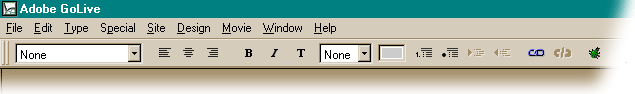
Fig. 3.15 Menu and tool bar layout of Adobe GoLive on Microsoft Windows
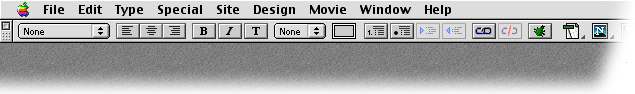
Fig. 3.16 Menu and tool bar layout of Adobe GoLive on Apple Macintosh
The best position for the menu bar is a wonderful exercise in Fitts’ Law. The graphical user interfaces of Apple Lisa and Macintosh put the menu bar at the top edge of the screen (Fig. 3.16). Opposed to that, Microsoft Windows puts the bar inside the document window, respectively inside the application window. Even if the application window is maximized on screen the menu bar is not at the top edge of the screen (cf. Fig. 3.15). The slightly different design leads to a huge difference in usability. The performance of the Macintosh approach exceeds Microsoft’s.
The explanation to this phenomenon is Fitts’ Law. Despite the fact that the menu titles have the same size on both platforms, objects on top of the screen have a virtually unbounded height. It does not matter how fast the user arrives at the menu bar. She cannot miss the correct vertical mouse position, because the movement is limited by the top edge of the screen. No vertical fine tuning is necessary to position the mouse pointer over the desired menu title [Tognazzini 92, p. 201] (also The Humane Interface – New Directions for Designing Interactive Systems by Jef Raskin [Raskin 2000, p. 94]).
A different form of menus are pop-up menus. They were originally developed for the Smalltalk environment at Xerox PARC. One of the mouse buttons is reserved to open the menu wherever the click occurs. The menu items of pop-up menus can be tailored to the context given by the mouse position. For example an EMPTY TRASH command needs only to be offered if the pop-up menu has been opened with a click on the trash can. Context sensitive pop-up menus – or context menus for short – are part of the graphical user interfaces Microsoft Windows and Apple Macintosh.
If the number of commands becomes too high to fit into a straight menu structure hierarchical menus are a way out. Some menu items are used as menu titles themselves. They reveal a second level next to the first column of menu items.
Based on Fitts’ Law, context menus would seem to be optimal. No mouse movement is necessary to open a context menu. But Bruce Tognazzini refers to experiments that show that this advantage is lost against a menu bar that is along the top edge of the screen. He argues, that the effect of the top edge on the first step of choosing the right menu cannot be beaten by context menus. After the context menu has opened no edge guides the mouse cursor to increase the virtual size of the menu items [Tognazzini 92, p. 203].
Considerations of consistency have another important impact on menu design. If the order of menus and menu items is consistent across the range of application programs the structure becomes predictable for the user. It can be remembered by means of spatial organisation. For example the second menu is always the Edit menu, that contains CUT, COPY and PASTE commands for the clipboard. Spatial consistency in user interface design is a precondition to reach a habitual interaction mode. That is, the user can act with confidence in the software environment and make full use of motor memory.
3.3.4 The Mouse and other Graphical Input Devices
Jef Raskin defines the graphical input device (GID) as «a mechanism of communicating information, such as a particular location or choice of object on a display, to a system» [Raskin 2000, p. 34]. The mouse is just one possible graphical input device. It was invented by Doug Engelbart and Bill English in 1963. They did additional tests with the light pen, the joystick, and various other experimental devices [English/Engelbart/Berman 67]. They found the mouse to be the fastest device and decided to use it for NLS. Other graphical input devices are for example touch screens, graphic tablets, track balls, and track pads.
The article A Morphological Analysis of the Design Space of Input Devices [Card et al. 91] – by Stuart Card, Jock Mackinlay, and George Robertson – provides a taxonomy for input devices. Referring to the model, the mouse is a relative pointing device. The position of the pointer is controlled by movement rather than by absolute position. The mouse is also a linear input device, opposed to a rotary device like the joystick. The latter generates angle values along two axes, that can be used absolutely as position and relatively as velocity for the pointer on screen.
The second physical property that is employable for graphical input devices is force. An application can be found in some notebook PCs where space is a critical issue. An extra button is placed between the keys G, H, and B. Horizontal force to this button is transposed to movements of the pointer on screen. Another example for the application of force would be a graphic tablet with a pressure sensitive pen.
Summarizing, the design space for graphical input devices is made up of all possible combinations of absolute and relative, linear and rotary, and position and force.
Raskin continues to define the primary button of a graphical input device as the GID button. A click «is to position the GID and then to tap the GID button.» [Raskin 2000, p. 34]. Definitions for drag, and double click actions follow analogously.
The previous section on menus has shown that graphical input devices should have an tremendous influence on the design of graphical user interfaces. The mouse is a Fitts’ Law device – it can be best modeled by a variation of Fitts’ Law, as Stuart Card and Thomas Moran have shown in User Technology: From Pointing to Pondering [Card/Moran 86, p. 496]. The importance of the edges of the screen follows immediately.
Other devices have different characteristic qualities that affect the usability of the entire system. For instance, all graphical input devices that are operated with a finger instead of the arm – i.e. track pads – are less sensitive for the Fitts’ Law effect at the edges of the screen.
![]() For a free PDF version of Vision and Reality of Hypertext and Graphical User Interfaces (122 pages), send an e-mail to:
For a free PDF version of Vision and Reality of Hypertext and Graphical User Interfaces (122 pages), send an e-mail to:
![]() mprove@acm.org I’ll usually respond within a day. [privacy policy]
mprove@acm.org I’ll usually respond within a day. [privacy policy]