Visualization Methods
User Experience Newsletter #17, September 2007
Dear User Experience Forum,
1 idea
2 moderators
3 years
17 newsletters
162 events
429 threads
783 comments
1.729 members
and
49.208 hits to our discussions over all.
This is the User Experience Forum by numbers. Though, I'd like to have a more engaging visualization. In fact, I pat on your virtual shoulders to express my thanks for the community experience behind the pure numbers.
Please continue to share your insights and participate in the discussions.
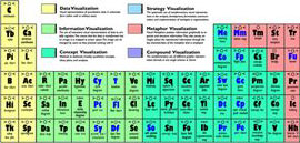
This newsletter features “A Periodic Table of Visualization Methods”. It's a wonderful collection and classification of different chart types for very different occasions:
I found it via
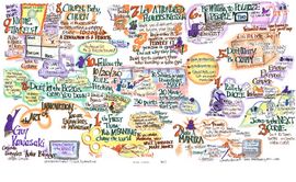
Some other favorites of mine are
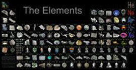
Category Periodic Table
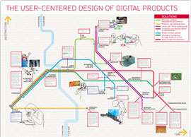
Category Metro Map: User-Centered Design of Digital Products
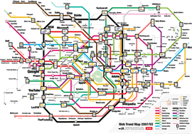
Category Metro Map: Web Trend Map
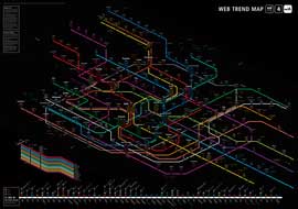
Category Metro Map: Web Trend Map v4
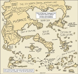
Category: Knowledge Map
What's your highlights? Please post them as response to this newsletter.
cheers,
Matthias